Showing posts with label archive raiding. Show all posts

Tuesday, April 9, 2019

Archive Raiding: Art Scans Batch #5


Oh, we're not done yet; not by a long shot. This time we're starting off with another unused design for the graphic design part of the project: one that I actually already covered here back in 2009, so let's see if I had anything insightful to say:

An earlier design of the book cover I did for graphic design part of the project. It's a flower with each petal depicting a summer scene. I like the flower idea, but the mostly solid blue background is a bit overpowering. While the final design wasn't very original, I think the front cover looks a lot better than this one.

Yeah, so not really. :D I think I was a bit harsh on this though. This is a solid concept; I think it could have made for a more creative piece of work than what I ended up with if I just developed it a bit more. That choice of lettering here though is WILD for the cover of presumably some kind of nature book.

(Plus, and I kind of hate to be gardensplaining here again, but daffodils: famously not associated with summer. And they're all over my final project stuff! I guess though, to be fair, the theme of the project was Summer Memories, not Accurate Summer Memories, so eh.)


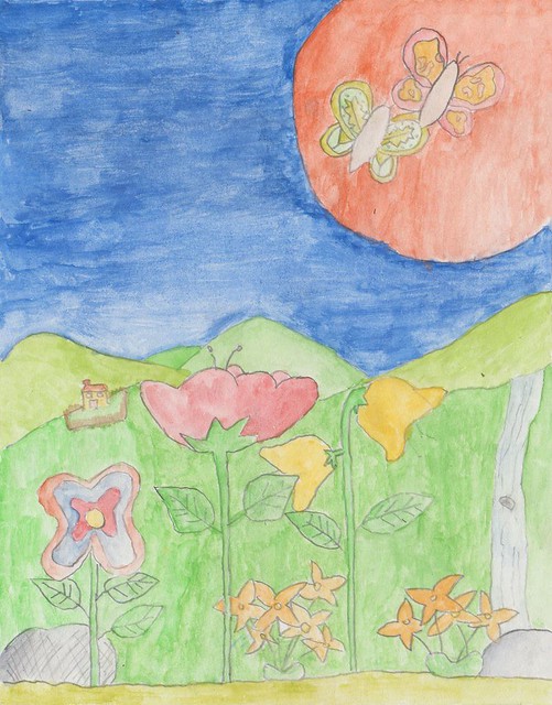
And yet more reposts! Fans of my DeviantArt (i.e. literally nobody) will recognize these from a collage I made in 2006 featuring these, the butterfly below, and a random mushroom. Very much appreciate the fave, tinyqueen007.

It's kind of a shame I didn't go on to use any of these designs in the final project work. I think they would have looked great on the batik I made. Well, maybe not the one on the left: it's a bit wonky, though I do appreciate the detail of it being perched on top of a flower here.


This one I think would have looked especially cool. Look at that rad-ass butterfly; it can't even be contained by pencil lines!

Thursday, February 23, 2017

Archive Raiding: Art Scans Batch #4

It's time for another round of Junior Cert. art scans. This batch I'm dubbing the mostly mixed media special - something I tried my hand at early on in the project, following a call to vary things up a bit. The end results... left much to be desired.

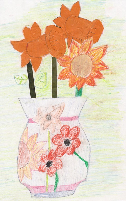
 photo flower vase_final con10.jpg

I don't know if you can tell, but I really didn't have the slightest idea what I was doing. :D Yikes, this is bad! Worse than the haphazard use of different mediums here though is the general colour palette. Besides the flowers in the vase, it's just so washed-out and ugly, and that puke green and blue background is horrible. Bleah!

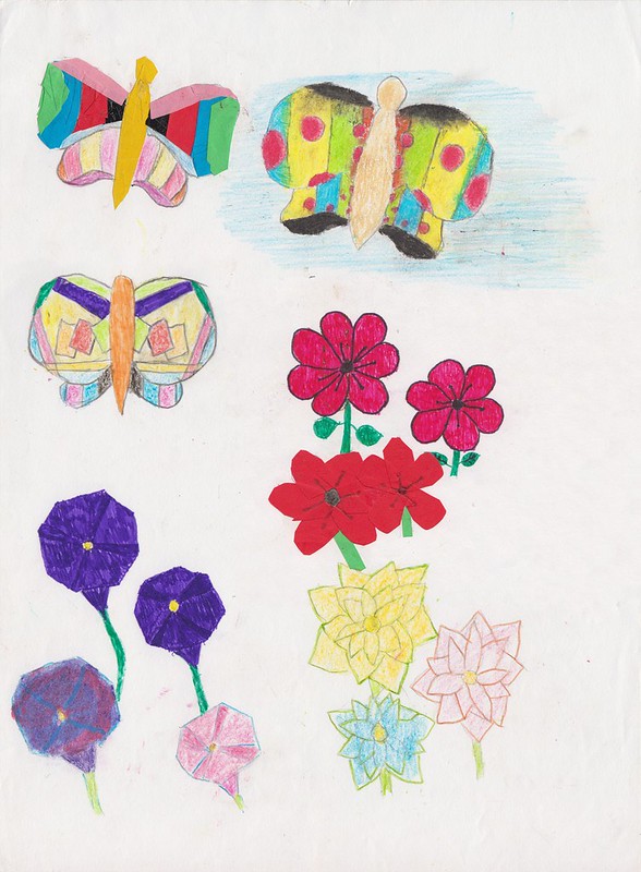
 photo cutup2-restoration3-png-final con6 jpeg.jpg

This is a little better though. The top left butterfly here is a mix of collage on top and colouring pencil underneath. The collage I think l pulled off much better here though - you really get the effect of it being made up of little bits of paper this time; the daffodils in the vase above just looked like solid orange blocks. But just like the daffodil leaves above, the bottom part of the butterfly here doesn't mesh with the collage bit at all, and that's not helped by my bizarre choice of colours on this bit.

The weird clown butterfly on the top right is pretty dope though. Not so sure about the oddly-designed one on the second row, which seems to be coloured-in with a pastel and marker combo. The rest of the page: yet more flat-looking flowers done in various mediums, even chalk (in the bottom left corner). If this wouldn't satisfy the art teacher, I didn't know what would!

It didn't. :D

 photo rose_final_jpeg.jpg

Getting away from mixed media atrocities for a while and man, what a difference six months makes. Maybe even less. The two uh.. pieces above would have been from some point in late '98. This I specifically remember I drew (based on an art book drawing) in May '99 because, as I was slowly shading this in, I was also keeping one eye on the Man Utd v. Bayern Munich Champions League Final. By the time I finished up, all hope for a Man Utd. win seemed lost as extra time ticked away. As an avid fan at time, desperately I resorted to praying for a win in those dying moments. Amazingly, those prayers were answered with two messy, miracle goals. You're welcome, Alex Ferguson. :D

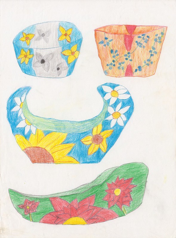
 photo bowls-final_n.jpg

Moving to the 3D part of the project, here we have some more potential bowl designs. With the exception of the top right one, these would have all been far more interesting than the one I actually made. That black and white-colour combo on the top left is such a cool idea! You know what, I might make that bowl still.

The one in the center here wouldn't have been a bad look either though. The bowl I made could have desperately used some of those white flowers on it to break up that awful wall of dark blue. Oh well, too late now.

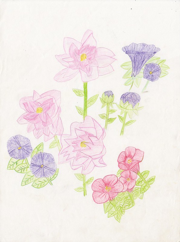
 photo flowers.jpg

More flowers, but from a slightly earlier stage of the project than the big rose above. I still hadn't quite grasped the whole shading thing at this point, but these are definitely a big improvement over say, the ones under the butterflies above.

Being a bit more well-versed in gardening type stuff at this stage though, I am noticing how weird the petunias - the pruple flowers here -  look in all this stuff.  Like most of the flowers I used throughout this project, I got the basic look of these flowers from a black and white photocopy from an art book, obviously not realizing that the rectangular sections in these flowers were meant to be a different colour. This ended up giving them this bizzare geometric shape that I just ran and ran with, right up until the final submissions of the project. Whoops. :D

Thursday, January 21, 2016

Archive Raiding: Art Scans Batch #3

It's time once again to venture into that uh, magical orange folder of Junior Cert. art work to discover what other dubious delights it has to offer.


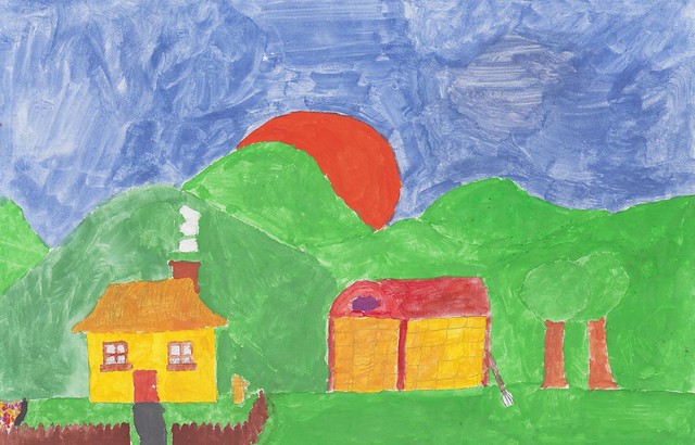
Yikes! :D So, this is the first thing I did in art class in the door on day one. We were given a choice of themes to base a painting on (I think I picked something vaguely summer related), as a means of gauging our artistic ability. (I'm sure it was a good way of keeping first years quiet for a few weeks too. :D) Needless to say, the teacher wasn't overly impressed by my efforts, or anyone else's for that matter. Personally, I blame the paint, which was this awful powder-based stuff that you needed to pick up with a wet brush and then rub the brush into your tray to finally get usable paint. Yeah, it was totally that. :D (In all seriousness though, I'm kind of surprised it hasn't all flaked off by now.)


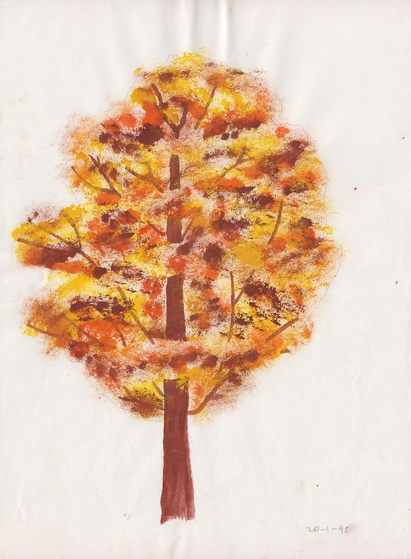
Coming in for particular criticism from that first exercise were the trees everyone was drawing, which now that I'm sorting through all this stuff, probably explains why we had this tree painting tutorial a few months later, though it felt a bit random at the time. You can't say that it wasn't effective though. The leaves on here were actually dabbed on with a sponge rather than a brush, which I think gives it an interesting look, and, it was kind of fun.


This isn't one I fondly remember. :D There I was the evening before school restarted in September. Suddenly, a thought came to mind: "Oh crap, didn't the art teacher give give me some work to do before the holidays; some photocopied flowers or something. If I don't get that for tomorrow, she'll kill me. I will be dead." And so, that's how I spent the last few hours of my summer holidays that year, painting these bloody daffodils. No wonder the shading's a bit iffy. Of course, after three months away from school, she didn't even remember.


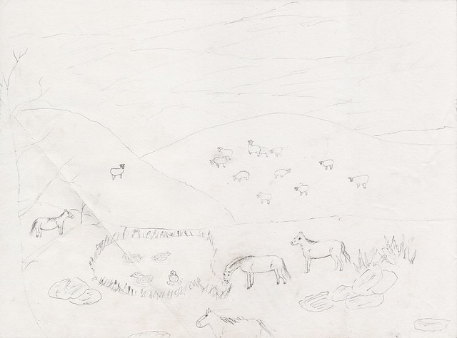
This one though: happier times. This, I drew on one of the rare occasions when we had a substitute in, a substitute who basically told us to continue with our project work or whatever before going off to do whatever twenty-somethings did before Facebook was invented. Freed from the ever-watchful eye of our usual teacher, I tossed aside the flowers THE MAN wanted me to draw (or that I had specifically decided to base my project around. I forget.) and instead, drew *gasp* animals.

For a first attempt, I'd say it's a decent-ish effort. I like those sheep definitely. Everything else is a bit on the cartooney side though. Also, the more I look at it, it more it looks like the horse on the far left is (a) very tiny, and (b) about to pull off a very impressive gymnastic maneuver on that tree branch.


Vases! Yeah, I seem to have lost track of the fact that I was supposed to be designing a bowl for the 3D part of my project at some point. Hmm, those green flowers on the bottom left look a bit odd. That 'bowl' on the bottom right though, I really quite like. I might have needed to re-position that daffodil, but the fuchsias; the color scheme: this would have been such a better design for the final piece rather than the freaking thing I ended up with. :D


Here we have one of the designs for the graphic design part of the project, a book cover. I think this was a potential back cover, colored in with ink if I'm not mistaken. Oof, that sky. The rest is better, but it's all a bit flat and lifeless. The almost total lack of shading doesn't help. That's something I had to be dragged, kicking and screaming, into doing. :D Even now, man, it's so much effort. Wouldn't it be easier if everything was just flat?


More fuchsias, as well as some other bramble-type thing. I really like the weird, skinny bee on here, whatever he's supposed to be doing. Not such a fan of the colors, which look really washed-out here.


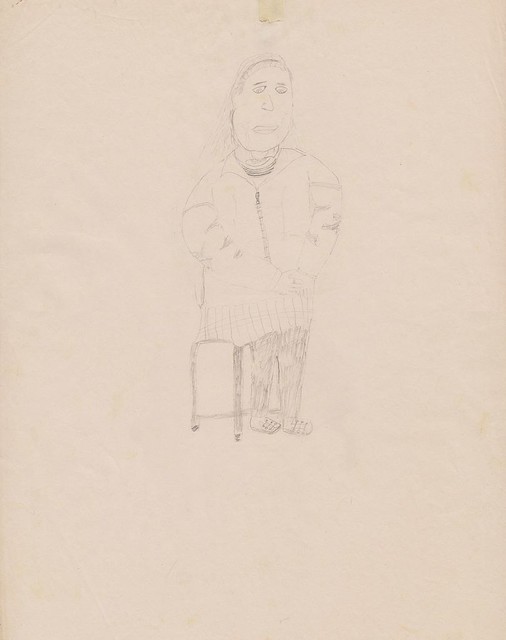
And finally, the life drawing hits keep on coming. This one definitely falls on the lower end of the scale. Not that it's a wide-ranging scale, admittedly. Look at the size of that head and those tiny legs. Worst of all though: those feet. Yeek!

Monday, December 15, 2014

Archive Raiding: Art Scans Batch #2

Sure we covered some basics; we did a little painting; and boy, did we do some life-sketching, but for the most part, the first year and bit I spent in art class was taken up composing entries for a series of competitions and (almost certainly terrible) art exhibitions. Here are all of them:


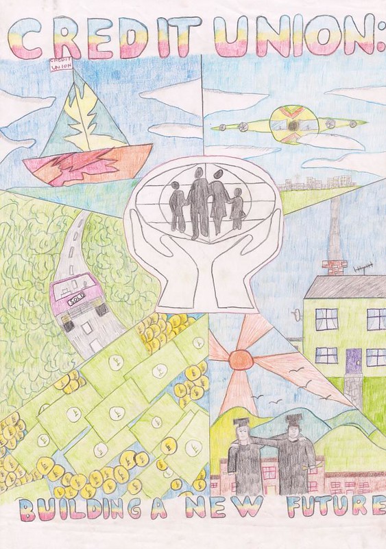
I'm not sure if it's still going, but the Credit Union Poster Competition was something I entered a at least twice as a kid. I didn't get anywhere with my first entry, but this one, I was feeling pretty confident about. Drawing-wise, it was definitely a cut above the one I'd entered in primary school, and with it only being only six months or so since I'd won a runners-up prize in the CallCard competition below, I was on a winning streak, man. How could I possibly loose? But nope, radical 90's yacht or not, I ended up empty-handed yet again. It's almost as if they didn't see the stoner plane, the fat stacks, or even the students, awkwardly embracing while clutching their degrees in a death grip.


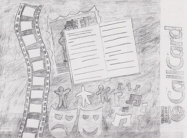
An entry to Telecom Éireann's (ask your parents) Design a CallCard (ask your parents) Competition (you guys still have competitions, right?). This was the only freaking competition entry during this whole time that I got anything for. :D

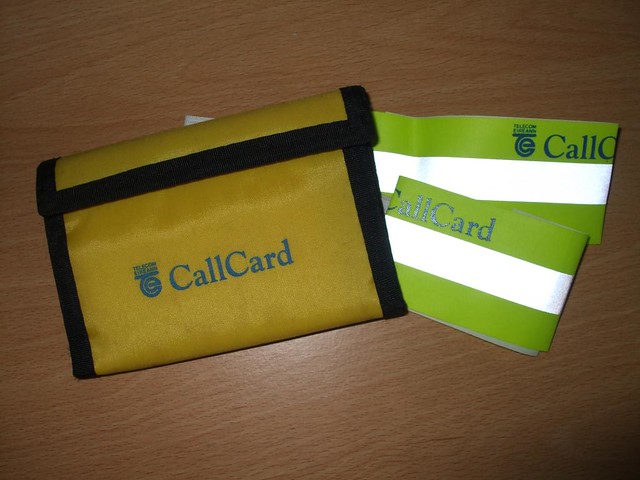
So, as you might be able to guess from the fairly unimaginative design, the theme for this was The Arts, and somehow, they liked this enough to give me a runners-up of a T-shirt, a couple of CallCards, a CallCard holder, a crappy wallet and a couple of CallCard-branded fluorescent armbands. I have a vague memory of a pen too, but don't quote me on that one.


Result! (Not sure what happened to the rest :D)

Having said that though, I wasn't the only runner-up from our school. There were like, eight in total. From one school. In a country-wide competition. I have some suspicions that my success here may have actually been part of some kind of publicity stunt, especially given the fact that the school got us into the local (county-wide) paper for our efforts, and, as far as I'm aware, this amazing success was never repeated again as long as I was going there. (follow the money)

I really wanted to get hold of that picture for this too. I know my mom kept a clipping but it seems to have vanished into thin air (that, or it's been taken by the Illuminati). If I ever do get a hold of it, it's going right in here. It's worth it for the miserable look on my face alone as I pretend to work on a fake art project for the benefit of our crappy-ass local newspaper.


This was my entry into the same contest the following year and you know what, screw you, Telecom Éireann! This was totally a decent concept for a sports-themed CallCard. There are definitely some problems: the dart board floating in front of the champagne bottle, the wonky-looking cup, maybe too much empty space at the bottom. But then, look at the little details: the framed jersey in the top right, the certificate on the left, the darts in the background, the ribbons on the medals. Come on, you couldn't have spared another runners-up prize pack, after I spent an entire Saturday afternoon on this? I could have been playing Goldeneye. I am right about the conspiracy, aren't I, you Oddjob-picking, screen-cheating bums. Sincerely, JiliK.


So, this was another contribution to the same drug awareness thing that I'd already been forced to enter a masterful piece of verse into, and I'm pretty sure that was the last thing the class took part in before we had to get going on our Junior Cert. projects too. Man, this poster seemed much cooler in my head, and even on the page before I coloured it in. With bolder colours and some dramatic shading, I think this could have turned out pretty well, but those were just alien concepts to me at the time.


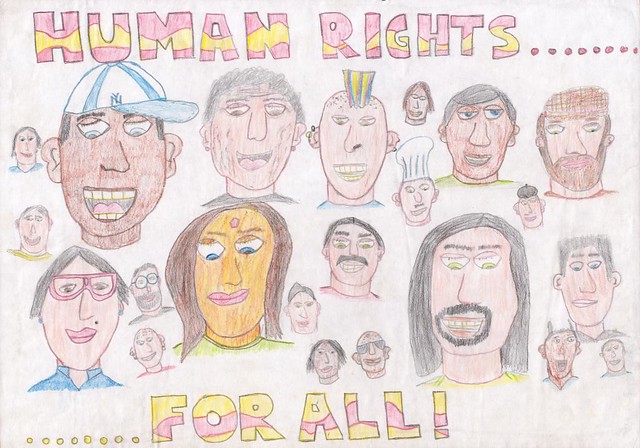
(...but mostly white people)

Drawn for some sort of human rights/maybe Amnesty International exhibition, I think this was the poster that somehow gave my art teacher the impression that I was good at drawing faces (see my Junior Cert. painting for evidence very much to the contrary). Looking at it again though, there are some pretty sweet ones up there: black Keith Flint, probably a successful Eurodance duo, two pretty racist French-looking guys. :D Quite liking the random, dramatic pause in the caption too.


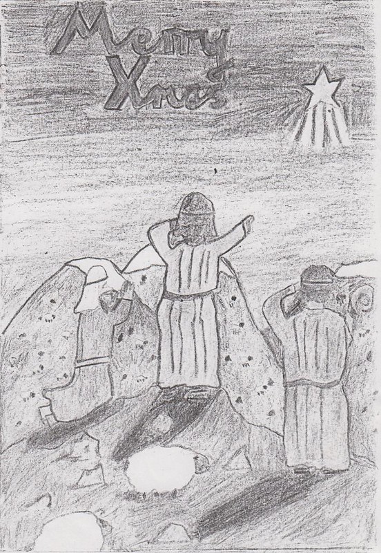
Crap! I knew I posted this somewhere before. I forgot that I gave it a whole blog post back in 2010, in which I said: "As far as I can recall it was an entry to some competition back then." (1998) "I really love how it says 'Merry Xmas', despite depicting a Nativity scene, almost as much as love how the hills that appear to be made of Christmas pudding."


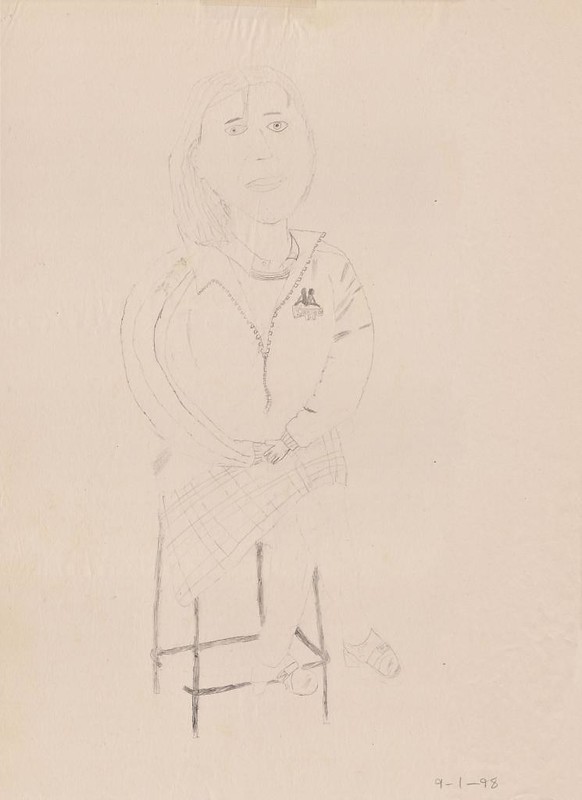
And finally, not competition-related, but I've got to burn through the rest of these somehow. Believe it or not, this may well be one of the better life sketches I did during my time in art class. Bloody hell, those hands! Those feet!

Thursday, February 27, 2014

Archive Raiding: The Millennium Clock


For a few years in secondary school I took Woodwork as a subject, or Materials Technology (Wood) as it was (bizarrely) called. During that time I produced a series of poorly-constructed, ill-conceived or just plain shoddy pieces of work, which we'll get to in time. Right now though I thought we'd take a look at possibly the biggest disaster of them all: the millennium-themed clock I made for as my Junior Cert. project in 2000.

Of the potential projects we could choose from, the millennium "artefact" seemed the most promising, given it's open-ended nature. Despite having carte blanche to make literally anything I wanted for this, the bad idea that immediately popped into my had, that I never wavered from, was a clock. And not just any clock unfortunately, but a large, ornate, antique-style one with a proper face and hands and all that stuff.


The original drawing. I think it got ripped up eventually from being carted around in my school bag.

And as I got down to drawing it, I continued to dig myself into an ever-deepening hole of big ideas without the skill or know-how to back them up. A curved top? Sure! Carving? No Problem! A door; a pane of glass; a light fitting? All in a day's work. In March 2000, with about three weeks left to the deadline, all I had to show was a few planks of crookedly-cut mahogany in a black bin liner.

If that wasn't bad enough already, I still had almost the entirety of my "folio" to do - a write-up of the the research, and the work that went into making the project. (Although being mostly blank, I guess it was technically accurate at that point. :D) If I was going to have this project in any way complete for the deadline, it was going to take an absolutely herculean effort over the impending Easter holidays that year.

While I did finally get started on the folio side of things on the first week of the holidays, there was also the vital matter of getting my terrible new web site up and running, and a third playthrough of Ocarina of Time to attend to, so as insane as it was, I didn't actually touch a piece of wood until the second, and final week of the break got started.


The clock's top two sets of dovetail joints. Believe it or not, quite an improvement over my previous efforts.

Finally, on Easter Monday afternoon, I got down to work. I started off with the basic frame of the clock, which was going to be kept together with a set of dovetail joints at each corner. Past experience told me I couldn't mark out joints accurately if my life depended on it. Rather than risking disaster for my final project, I decided on a different tack. This time I cut out all the pins (pointy triangular bits) first. Once I'd finished those, I made the tails (the slots they need to go into) to measure, chiselling out each one bit by bit, widening them as necessary until they fit exactly - a painstakingly slow process that gave me ample time to get acquainted every Moby single from Play, Tom Jones' Sex Bomb and that Irish dance uh... classic: Maniac 2000, which were all constantly being piped out from 2FM into the earphones of my trusty Walkman, the only thing that was keeping me going through this ordeal.


The tip of the clock. Man, that half-assed attempt to smooth it out with a file really hasn't improved with age.


The flame bit looks better than I remember though. A bit wonky on the left though, and the top, and there's a chip missing; but that right side? Pure quality.

With the joints getting there, the next thing I tackled was the front of the clock, which needed a flame-shaped hole cut out at the bottom of it and a curve applied to the top. Both of which I cut out with a coping saw, both of which were jagged as shit afterwards. :D I did the best I could with as spokeshave on the top and later, a file on both. After a significant effort I managed to get the top looking alright, but I just didn't have the time or know-how to make any real impact on the flame bit.


No that first picture wasn't lit weirdly or anything. It really is bright yellow plastic.


Jeez, this is as rough as a badger's arse. :D In my defence, I'm pretty sure I would have needed a different spokshave for concave stuff. Plus it was inside. It was fine.

After that, it was finally time to face up to the clock situation. Although I'd already given up on the idea of installing a fully-fledged mechanical clock movement, up until the previous week I was still hopeful that I'd be able to get hold of a battered-powered one and some sort of face, and have a proper, working clock in the end. All I'd managed to come up with though was a yellow, plastic clock, from a pound shop. With no expertise in the area whatsoever and only days to go to the deadline, literally the only thing I could do with this clock was to jam the entire thing into a hole in the front of, what had now become a big, hollow plastic clock receptacle; cheap-ass yellow frame and all.


Year 2000! Wooooo! (Good grief, how did this ever seem like a good idea? :D)


Bloody hell. It just gets worse the closer you get. Bear in mind that I'd almost completed three years of Art class at this point too.


Fuck me.

As you might be able to gather from the pics above, the uh, "carving" above the clock proved to be a much bigger disaster. Again, knowing nothing about carving, and having only the cheapest, crappiest tools at my disposal, things could have only gone worse if I'd used a set of car keys instead, or tried to fix the already huge mess with a sloppy coat of gold paint. Yeah.


The back door. Ignoring the fact that the hinge is on the wrong way, I don't think I even tried to polish it before I handed this in. The stuff that's stuck to it was always there.


The glass here wasn't actually supposed to be frosted, or brown. I dispatched my dad to get some and this is what he decided to go for. I actually think it works pretty well though.

With that much out of the way, unlike what it says in the folio I'm sure, this is when my Dad crashed the party, attaching the back door (borrowing a handle from one of our cupboards for it, which is still missing to this day), the front panel, and the pain of glass behind the flame shape. Usually I'd be furious at him butting in like this, but I guess I had so much mahogany dust lodged in my sinuses at this point, I felt I was doing enough myself already. I pretty sure I glued the joints together though and by the end of the week, against all odds, the clock was more or less fully assembled.


It's a pretty nice handle. I should really put it back where it came from at this point though.

The unfinished folio though, I got all to myself. (Lucky me.) Reverse engineering my research from the now almost finished piece and making a few uh, minor adjustments to the "making of" section for said piece, I spent several nights throwing it together in MS Publisher, employing the basic graphic design skills I'd picked up from working on my web site throughout. As per the woodwork teacher's suggestions, I crammed the thing full of sketches, as well as doing one section in my own (horrendous) handwriting - proof that you hadn't just printed the project off the internet, apparently.

I mean, really, who would waste their time putting a Junior Cert. woodwork folio on the internet...

Sunday, December 8, 2013

Archive Raiding: Art Scans Batch #1

Back in a galaxy far, far away, I took Art, Craft and Design for the Junior Cert. (kind of the Irish GCSEs). Many years later, I've still got all the work I did for it tucked away in a big, orange A2 folder; under a sofa, if you must know.

The best of what's in there I've already posted years ago on deviantArt, but there's a whole lot more to it than that; stuff that I haven't seen in over a decade. Now that I've got a half-decent scanner to use, I thought it might be fun to finally revisit it.


Ah, this is pretty nice. One of the many, many pieces of final project preparatory work we'll encounter, I'm using a mix of colouring pencils and paint here. Not much in the way of shading, but I was pretty early into the project here, judging by the date.


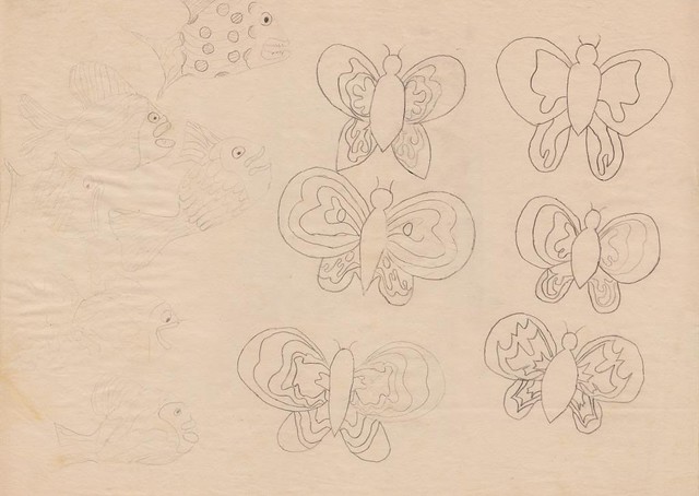
Jumping back a little further, this I would have dawn some time in late 1998, before I'd picked flowers as the sort-of central focus of my project. (Boy, did I get some stick for that :D). Butterflies, and I've gotta say a couple of cool-looking ones here, I ended up incorporating quite a bit into my final pieces though. Cartoon fish, not so much.

I do really like the expression the second one from the bottom has though. Oh, and the fish just above him to the left; that's a nice little action pose there.


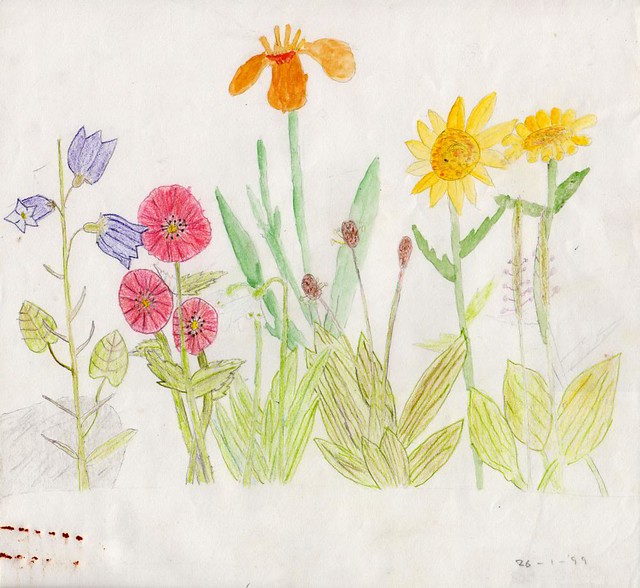
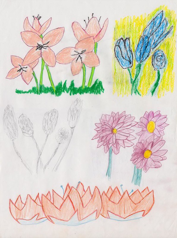
Scan number #3 is: some more flowers. We've got some more mixed media going on here too with the top two being both done with pastels and the rest with colouring pencils (or just a pencil in the case of the middle right one). Not great really, and no shading again, which elicited endless complaining from my teacher (but she was right).


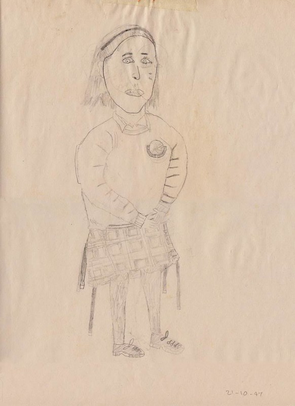
And finally, *yeesh* it's my first attempt at life-sketching from October '97 - something we did about once a month using classmates as models. It's something that I never got particularly good at, but then it's something that never interested me a whole lot either.

Oh, and to be clear, none of these sketches are in in any way representative of the girls that were my class. They were all significantly less ogre-like in reality. :)

Thursday, May 17, 2012

Archive Raiding: The Not-so-super Bowl


In a box, in the corner of a spare room, under a table, I've had this slightly cruddy papier mache bowl tucked away, being ignored, for the last ten years or so. When events conspired to move this box moved a few feet from my PC, what else could I do but grab a camera and finally document this er, fine piece of work.

Not that anyone would guess from the highfalutin potential designs I was churning out for my Junior Cert. Art, Craft and Design project, but this was the phoned-in, basic-ass bowl I made for the craft part of the project. And worse still, it was always the only one I ever intended to make. All that other stuff was just complete horse shit :D


A little sample of what I'm talking about. Obviously these would all have have been ceramic. But that would involve some actual work, and screw that.

It's not the basic, unimaginative shape of thing that makes me dislike it though. It's everything else, from the deformed, mismatched flowers to the sloppy painting to the dodgy, green rim job. :D Ugh, and that weird green bit, sort-of leaking down from inside the rim: just awful.

I guess it couldn't really have turned out too much better though. I grudgingly cobbled together the bowl itself in the middle of my Christmas holidays in 1999 and I ran off the entire paint job one Sunday evening around February, colouring in a design that, ironically, I barley even planned out. The paints I had to borrow from the art room. And despite being told by art teacher to take them, I still snuck them out in as ninja-like a fashion as I could, knowing that two or three teachers were bound to shout at me for stealing them without taking even a nanosecond to consider an alternative scenario. That's the type of awesome school I went to folks. :D

But enough of that. Let's take a closer look:


I kind of like this sunflower actually. It has a nice abstract thing going. The red flower to the right looks pretty good too. Everything else is a bit of a mess though.


You know, both of these purple flowers could have turned out pretty well if I put a bit more effort into them. Everything else is pretty much a disaster though. And how did I get those blotches of red and green paint onto it? And how did I leave it like that?

And holy shit, I've just noticed that I made one of those fuchsia flowers green. (Those are supposed to be fuchsias, by the way.) I didn't even notice that at the time. Bloody hell, what a complete fuck up this whole thing was. :D


Purple, purple, purple, purple, purple. Okay, maybe not a complete fuck up. This sunflower is pretty awful though, lacking any kind of definition whatsoever. Ugh, and those bloody green bits. The only justifiable reason I could see for putting the two big green blobs on the thing would be to cover up some major screw up I made, but that wasn't the case at all. I put them there intentionally, on both sides of the bowl.


Compared to the red flower here, this blue one just looks deformed.I wasn't even trying here. :D


They're a bit messy (surprise!), but I quite like the bold, vibrant colours on the daffodils here. I'm guessing the much lighter one on the right was intentional, but the contrast between them looks makes this look really odd.


Moving over to left a bit more, these three flowers aren't too bad. The left one needs a bit more shading, but I quite like the look of the other two. Well, the heads at least; the stems are really pretty terrible, just like every other one on here.


Shifting back a bit to the right, between the two last sections, I think this is probably the bowls best, most competent-looking side.


The inside. Up until the day I was painting the bowl, I didn't actually plan to do anything inside it. I quickly came up with this just before I did it. Again, it's more the dodgy shading here than the design itself that lets things down. The middle flower here isn't too bad actually. But ugh, look at that daffodil.


I'm pretty sure more effort went into drawing this rough sketch of the inside than into any aspect of the actual bowl.


Aside from being a bit too dark a shade of blue, the paint job I did on the background really is shoddy. You get a pretty good view here of just how patchy it is here. It definitely needed a second coat, but I don't think I even noticed that at the time.


The rim; expertly done just as you'd expect.


Didn't they realise how this would affect the future value? I guess this is my exam number, written on by someone with a marker.

And with that, back into it's box it goes, banished to forever reside on top of a very high shelf. Well, until someone finally breaks it anyway. If you'd like to see some more pics, I've put up practically every one I took of it in this Picasa gallery:


Uh, have fun. :D