TL;DR Version: I've remade a screensaver from my old site, get it here.
Back in the Spring of 2000 I was in the middle of finishing up my Junior Cert. art project. The theme I'd picked for it was "Summer Memories", so in the run-up to doing the final painting, graphic design, 3D and craft pieces I was cranking out practice drawings and paintings of flowers, butterflies and the like as well as design ideas for my final project submissions.
In the Summer of that year I took some of those drawings (and some other stuff) and made them into a little screen saver. I called it the Artwork Screensaver and uploaded it to my old web site on the soon-to-be-closed-down GeoCities.
A couple of months ago, I set about remaking that screensaver with higher resolution images and lots of new screens. I put the finishing touches to it a few weeks ago and popped it up on my web site, where you can grab it, should you feel the need to do so.
After I'd finished, I thought it would a nice idea to go through the saver screen by screen and give a little background on the bits and pieces of feeble artwork it contained. And that's exactly what we're going to do. Hey, come back!
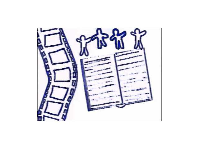
Screen 1: How abstract. This comes from a not-so-great design I entered in Telecom Eireann's Design a CallCard competition in 1997, in which I was one of many, many runners up. Seriously, there were about seven in our school alone. For the original screensaver I scanned in a photocopy of the design (TE kept the original), cropped it to this and messed about with the image a bit in a program called Repligator, I think.
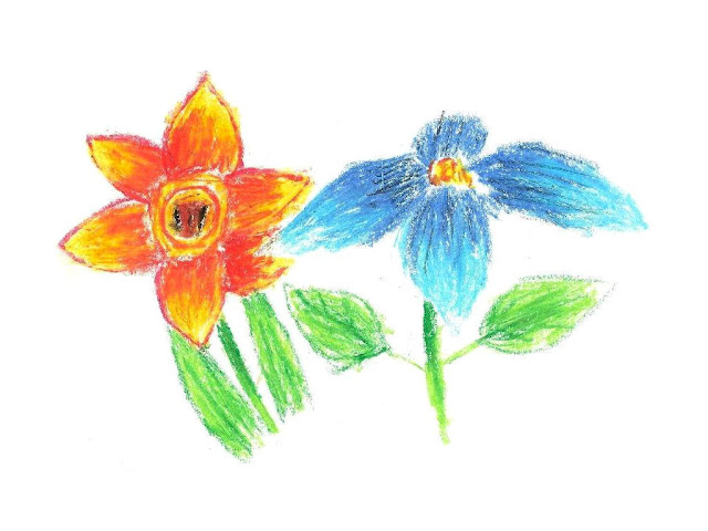
Screen 2: Two flowers I drew one day at home while I was messing around with some pastels. I'm pretty sure I was finished with the whole art project at that stage, so I guess these were done on my own time.
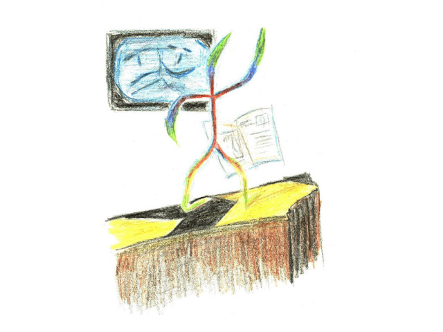
Screen 3: A little drawing I did sometime early in 2000. After having seen this documentary on a modern artist one night, I decided that anyone could crank out the type of stuff he was doing. Within the next few days I set out to draw something as arty and pretentious as possible and this was what I came up with. I really liked the drawing so it got included as the third screen in my super-pretentious Artwork Screensaver™. I think they call that "hypocrisy"
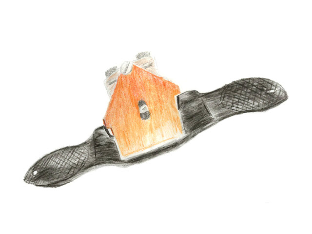
Screen 4: This was a practice sketch I did the night before my Junior Cert. sketching exam. It's of a spoke shave, which was one of the tools I used to craft my awesome (er,... not so much) Woodwork project for the Junior Cert. It's a bit on the wonky side, but at least it resembled the thing I was sketching, not like the life sketching I was cranking out at the time, those things are scary. :D
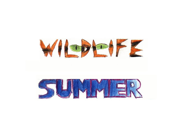
Screen 5: These come from a sheet of lettering styles I was trying out for the graphic design part of the project. I still think the top one looks kind of neat, with the menacing eyes in the background. The bottom one however... Well, it would look a lot more appropriate if it was preceded by "This" and followed by "a cyborg vigilante fights commie ninjas from the 80's".
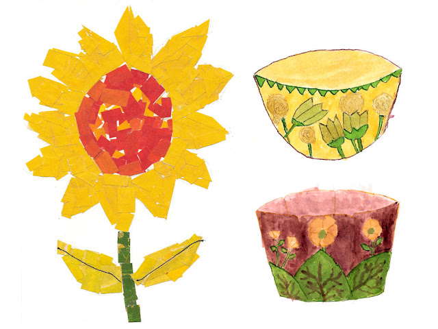
Screen 6: The last five screens were all featured in the old screensaver, but here we have the first all-new one (get excited, people). On the left is a flower made from bits of cut up magazines with two bits of black thread for leaf veins. It's truly a triumph of stick-based glue technology. On the right are two potential designs for the bowl I was going to make for the 3D part of the project. They're both coloured in with ink, which I remember as being a complete pain in the ass to work with.
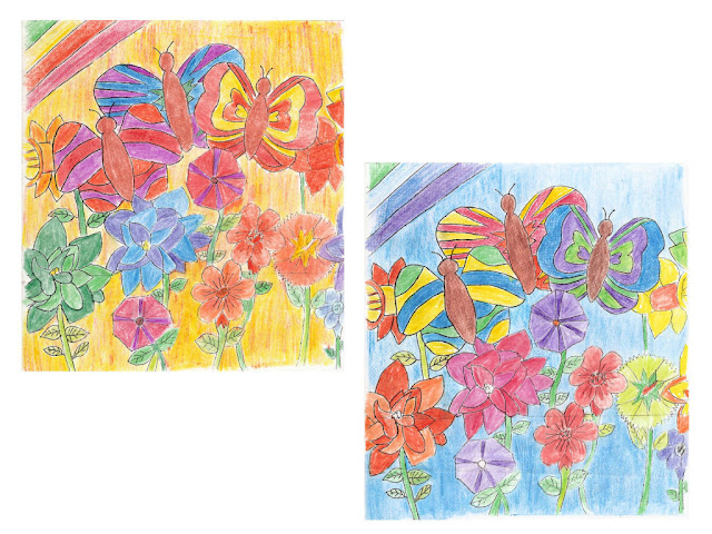
Screen 7: These were two alternate colour schemes for the batik I did. Looking at these, I kind of prefer the blue one to the one I actually used. Oh well, too late now. :D
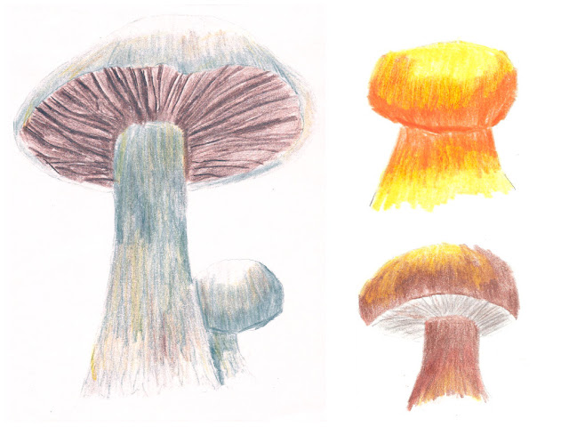
Screen 8: Some 'shrooms. If I remember right, I did these during the mid-term break in October/November 1999. The one on the left turned out pretty well I think, but didn't scan too well though. Even though I only put this screensaver together a few weeks ago, I'm scratching my head as to why I included the janky looking orange one. I do like the way it looks like it's casting a light onto the brown one though.
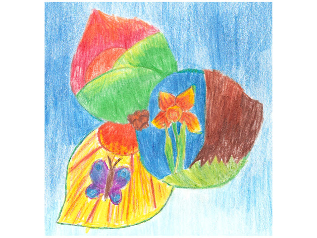
Screen 9: An earlier design of the book cover I did for graphic design part of the project. It's a flower with each petal depicting a summer scene. The title of the book was taken from the same sheet of lettering as screen 4, but I cropped it out here. Spoiler: It was "Summer". I like the flower idea, but the mostly solid blue background is a bit overpowering. While the final design wasn't very original, I think the front cover looks a lot better than this one.
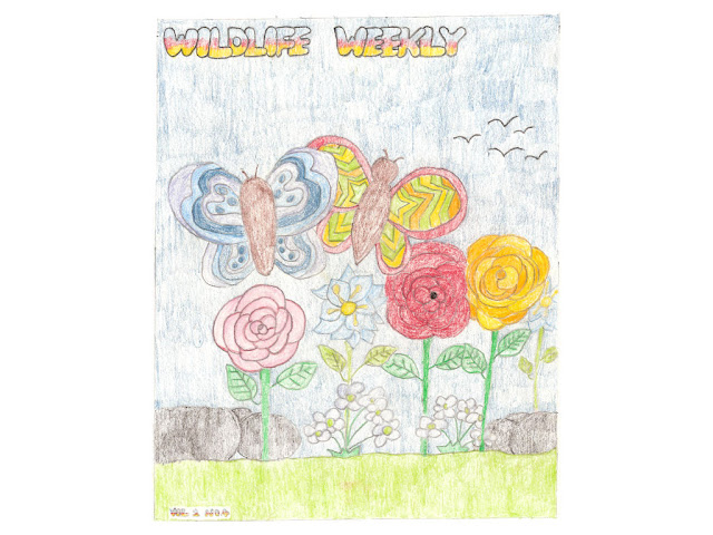
Screen 10: An even earlier design for the book cover. This was done while the concept of shading was a bit of an alien concept to me, so everything looks very flat. I really like the butterfly patterns though, especially the one on the right, it's looks like a crazy cartoon explosion.
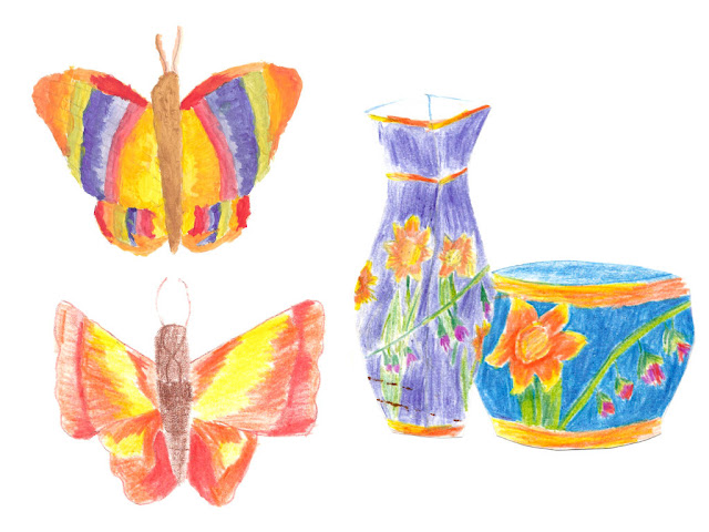
Screen 11: Here we have two butterflies - one done in paint and a lopsided one done with colouring pencils. On the right is another potential design for my bowl and for some reason, a vase (with markings from a rusty paper clip on it).
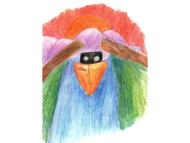
Screen 12: I'm not sure what part of the project this was intended for, but I like the look of it. Those lopsided windows were totally intentional, by the way.
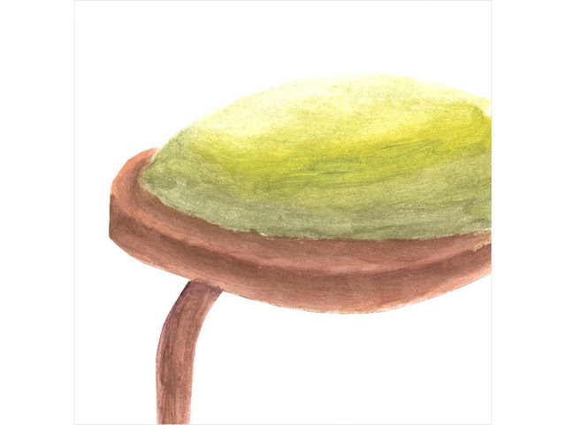
Screen 13: A section of a chair I painted the same night as I sketched the spokeshave in Screen 4. I was intending on pasting this over the laughably awful-looking shoes the girl in my painting had. On reflection, that may not have been the best of ideas, so I'm glad I didn't get the opportunity.
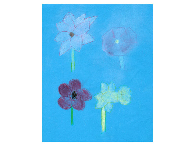
Screen 14: Okay, this is just plain bad, but I spent valuable time doing this and I'll be damned if that was all for nothing. :D What we've got here are some flowers coloured in with chalk of all things, apart from the one in the bottom left, which was (badly) coloured in with pastels.
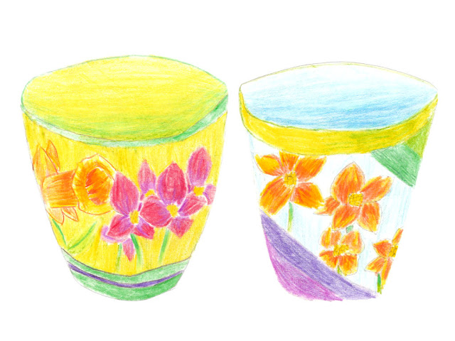
Screen 15: The final screen. Here are two more potential designs for my 3D piece. I love how all these potential designs look way better than the one I finally made - a basic papier-mâché bowl with a messy paint job. (EDIT: Man, I really need to get some photos of that monstrosity up sometime. :D)
No comments:
Post a Comment