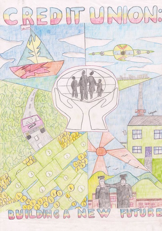
I'm not sure if it's still going, but the Credit Union Poster Competition was something I entered a at least twice as a kid. I didn't get anywhere with my first entry, but this one, I was feeling pretty confident about. Drawing-wise, it was definitely a cut above the one I'd entered in primary school, and with it only being only six months or so since I'd won a runners-up prize in the CallCard competition below, I was on a winning streak, man. How could I possibly loose? But nope, radical 90's yacht or not, I ended up empty-handed yet again. It's almost as if they didn't see the stoner plane, the fat stacks, or even the students, awkwardly embracing while clutching their degrees in a death grip.
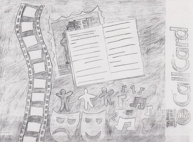
An entry to Telecom Éireann's (ask your parents) Design a CallCard (ask your parents) Competition (you guys still have competitions, right?). This was the only freaking competition entry during this whole time that I got anything for. :D
So, as you might be able to guess from the fairly unimaginative design, the theme for this was The Arts, and somehow, they liked this enough to give me a runners-up of a T-shirt, a couple of CallCards, a CallCard holder, a crappy wallet and a couple of CallCard-branded fluorescent armbands. I have a vague memory of a pen too, but don't quote me on that one.
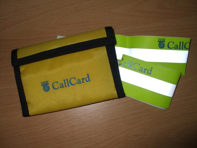
Result! (Not sure what happened to the rest :D)
Having said that though, I wasn't the only runner-up from our school. There were like, eight in total. From one school. In a country-wide competition. I have some suspicions that my success here may have actually been part of some kind of publicity stunt, especially given the fact that the school got us into the local (county-wide) paper for our efforts, and, as far as I'm aware, this amazing success was never repeated again as long as I was going there. (follow the money)
I really wanted to get hold of that picture for this too. I know my mom kept a clipping but it seems to have vanished into thin air (that, or it's been taken by the Illuminati). If I ever do get a hold of it, it's going right in here. It's worth it for the miserable look on my face alone as I pretend to work on a fake art project for the benefit of our crappy-ass local newspaper.

This was my entry into the same contest the following year and you know what, screw you, Telecom Éireann! This was totally a decent concept for a sports-themed CallCard. There are definitely some problems: the dart board floating in front of the champagne bottle, the wonky-looking cup, maybe too much empty space at the bottom. But then, look at the little details: the framed jersey in the top right, the certificate on the left, the darts in the background, the ribbons on the medals. Come on, you couldn't have spared another runners-up prize pack, after I spent an entire Saturday afternoon on this? I could have been playing Goldeneye. I am right about the conspiracy, aren't I, you Oddjob-picking, screen-cheating bums. Sincerely, JiliK.

So, this was another contribution to the same drug awareness thing that I'd already been forced to enter a masterful piece of verse into, and I'm pretty sure that was the last thing the class took part in before we had to get going on our Junior Cert. projects too. Man, this poster seemed much cooler in my head, and even on the page before I coloured it in. With bolder colours and some dramatic shading, I think this could have turned out pretty well, but those were just alien concepts to me at the time.
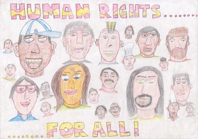
(...but mostly white people)
Drawn for some sort of human rights/maybe Amnesty International exhibition, I think this was the poster that somehow gave my art teacher the impression that I was good at drawing faces (see my Junior Cert. painting for evidence very much to the contrary). Looking at it again though, there are some pretty sweet ones up there: black Keith Flint, probably a successful Eurodance duo, two pretty racist French-looking guys. :D Quite liking the random, dramatic pause in the caption too.
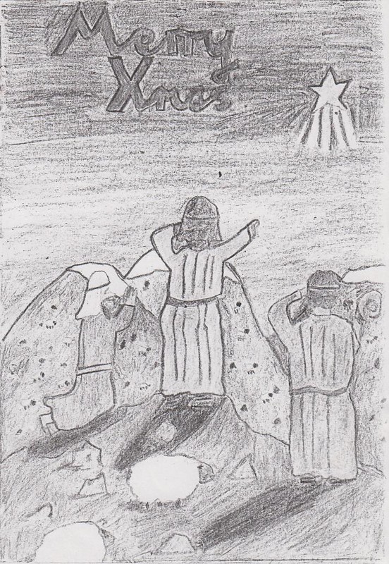
Crap! I knew I posted this somewhere before. I forgot that I gave it a whole blog post back in 2010, in which I said: "As far as I can recall it was an entry to some competition back then." (1998) "I really love how it says 'Merry Xmas', despite depicting a Nativity scene, almost as much as love how the hills that appear to be made of Christmas pudding."
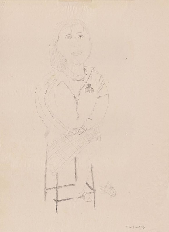
And finally, not competition-related, but I've got to burn through the rest of these somehow. Believe it or not, this may well be one of the better life sketches I did during my time in art class. Bloody hell, those hands! Those feet!
No comments:
Post a Comment