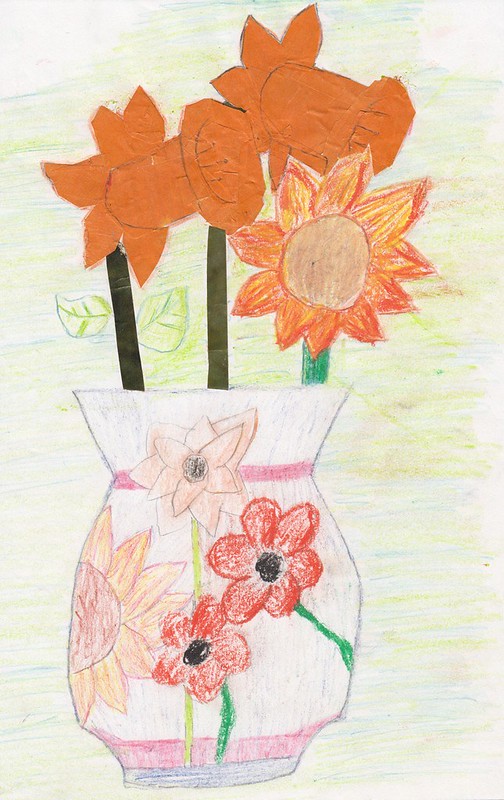
I don't know if you can tell, but I really didn't have the slightest idea what I was doing. :D Yikes, this is bad! Worse than the haphazard use of different mediums here though is the general colour palette. Besides the flowers in the vase, it's just so washed-out and ugly, and that puke green and blue background is horrible. Bleah!
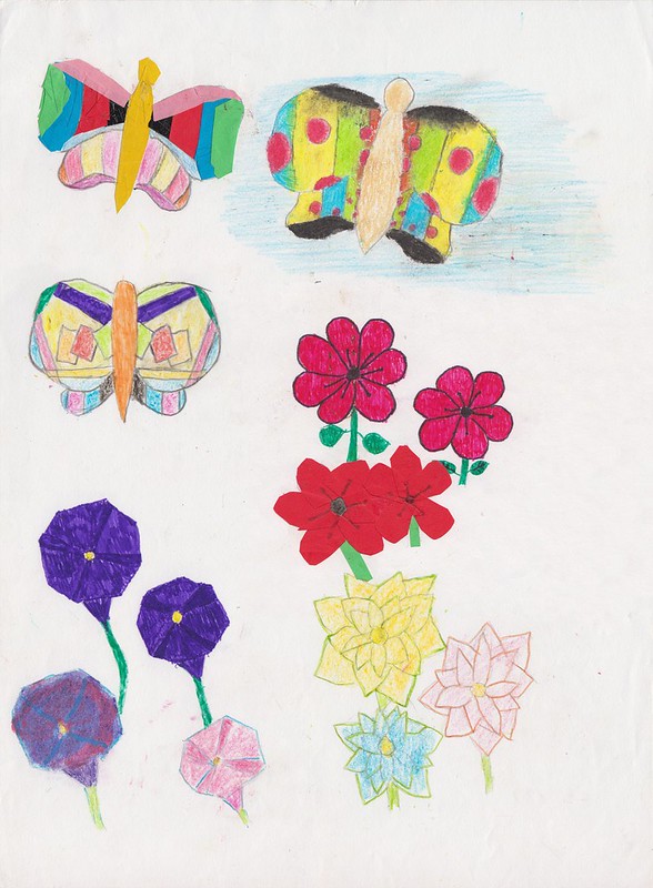
This is a little better though. The top left butterfly here is a mix of collage on top and colouring pencil underneath. The collage I think l pulled off much better here though - you really get the effect of it being made up of little bits of paper this time; the daffodils in the vase above just looked like solid orange blocks. But just like the daffodil leaves above, the bottom part of the butterfly here doesn't mesh with the collage bit at all, and that's not helped by my bizarre choice of colours on this bit.
The weird clown butterfly on the top right is pretty dope though. Not so sure about the oddly-designed one on the second row, which seems to be coloured-in with a pastel and marker combo. The rest of the page: yet more flat-looking flowers done in various mediums, even chalk (in the bottom left corner). If this wouldn't satisfy the art teacher, I didn't know what would!
It didn't. :D

Getting away from mixed media atrocities for a while and man, what a difference six months makes. Maybe even less. The two uh.. pieces above would have been from some point in late '98. This I specifically remember I drew (based on an art book drawing) in May '99 because, as I was slowly shading this in, I was also keeping one eye on the Man Utd v. Bayern Munich Champions League Final. By the time I finished up, all hope for a Man Utd. win seemed lost as extra time ticked away. As an avid fan at time, desperately I resorted to praying for a win in those dying moments. Amazingly, those prayers were answered with two messy, miracle goals. You're welcome, Alex Ferguson. :D
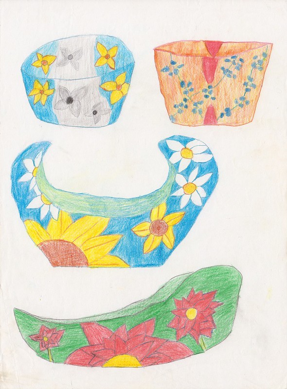
Moving to the 3D part of the project, here we have some more potential bowl designs. With the exception of the top right one, these would have all been far more interesting than the one I actually made. That black and white-colour combo on the top left is such a cool idea! You know what, I might make that bowl still.
The one in the center here wouldn't have been a bad look either though. The bowl I made could have desperately used some of those white flowers on it to break up that awful wall of dark blue. Oh well, too late now.
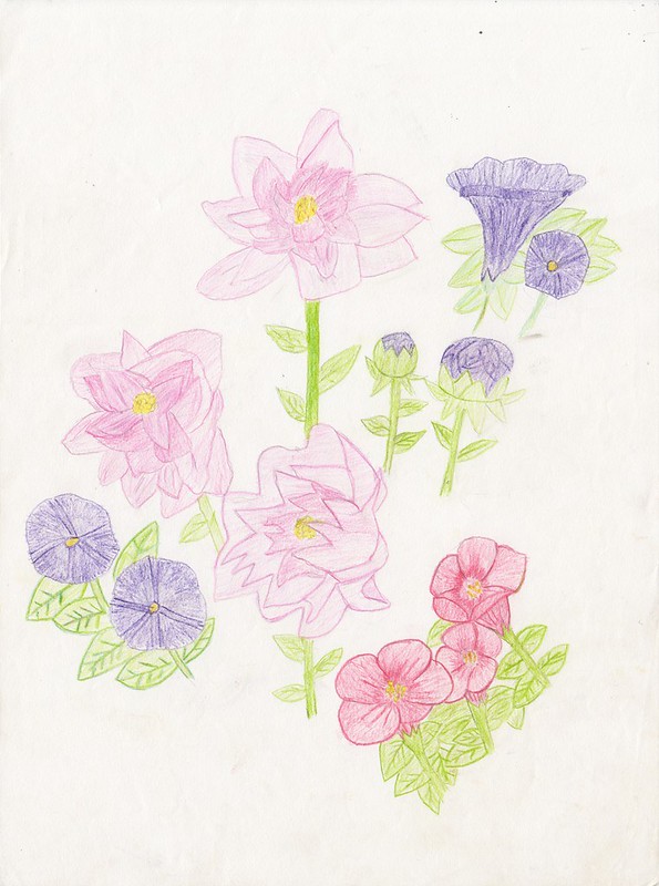
More flowers, but from a slightly earlier stage of the project than the big rose above. I still hadn't quite grasped the whole shading thing at this point, but these are definitely a big improvement over say, the ones under the butterflies above.
Being a bit more well-versed in gardening type stuff at this stage though, I am noticing how weird the petunias - the pruple flowers here - look in all this stuff. Like most of the flowers I used throughout this project, I got the basic look of these flowers from a black and white photocopy from an art book, obviously not realizing that the rectangular sections in these flowers were meant to be a different colour. This ended up giving them this bizzare geometric shape that I just ran and ran with, right up until the final submissions of the project. Whoops. :D
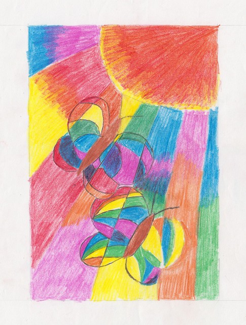
Some more butterflies, that appear to be flying right into a very small sun. This was an idea I had for the back of my book cover for the graphic design part of the project. I was going for a stained glass effect here - a solid idea I think, but this first stab at it was pretty rough around the edges. Woof, look at that sun. It's almost a square!

Getting back to some mixed media business, and speaking of blue, these are all meant to be fuchsias, I think. Who could tell? :D And they just keep getting worse as you go down!
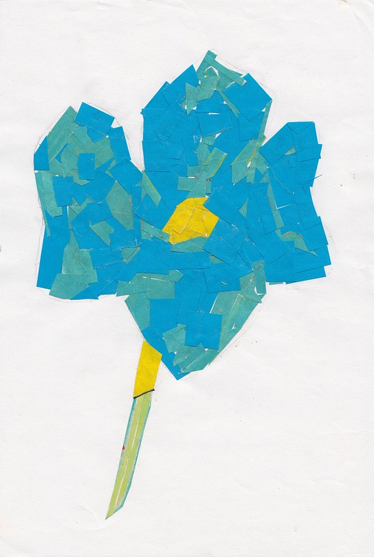
More collage work, and possibly my last attempt at it, though this is definitely a step up from what I'd done so far. There isn't much definition to the flower, but I like the blue and teal combo on the petals, and even having just two different colours on those instead of one makes this far more visually interesting than my earlier efforts. And, I didn't use any marker this time, just a bit of black thread on the stem; I went all-in on with practical materials. Mixed media was a mistake.
And now friends, we come to the newsprint section of this batch, which I've had to pick up the pace on because there are even more terrible life sketches mixed through this stuff than I'd previously thought.
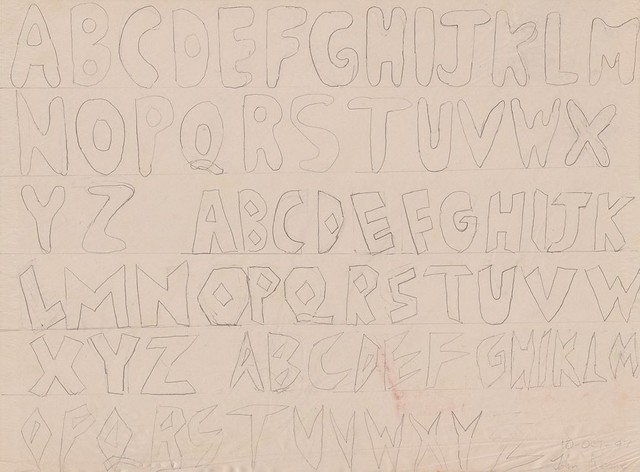
To start off with though: some lettering. In what was, I guess, some early prep for the graphic design part of the project, our teacher held little competition to see who could come up with the most creative lettering. The stakes were high: there were erasers, and pencils in the balance. Needless to say, my first set of letters here weren't going to win any prizes. For my second, I went for a set heavily inspired by the Super Mario World logo. And, for my third, I did this vague, sort of "rock" font and... I won! Well, I was among the winners. I got a free art eraser and a B pencil at least. Hey, that's not to be sneezed at!
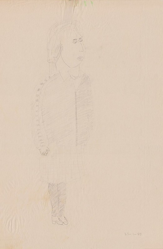
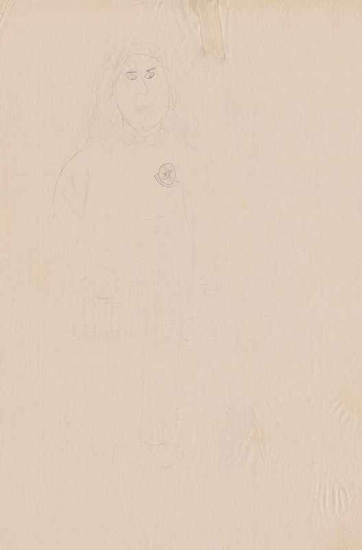
Certainly not winning any prizes though: yikes! You know, I think I remember this girl from her coat. She was like this petite brunette. Yeah, not here though. :D
And on the other side... This one's kind of hard to make out; the pencil was very faint here. Trust me though: it's terrible. The proportions are out of control here, like someone took this girl and compressed her horizontally.
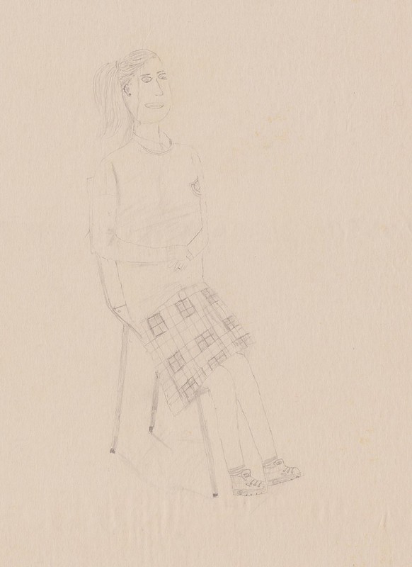
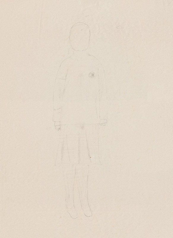
This is.. actually not bad though. Her hands and feet are a bit small, and well, her tummy and left arm look completely flat - like Paper Mario flat. But, other that that though: not bad.
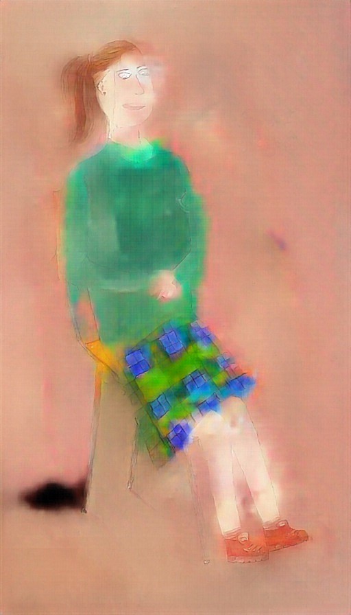
For yucks I ran this one through Paints Chainer - a site someone posted on GAF that colours in drawings automatically, through what I can only presume is some form of witchcraft. It had a fair amount of trouble here, but with a bit of tinkering, I was able to recreate the horrible green school uniform that was foisted upon us with pretty reasonable accuracy.
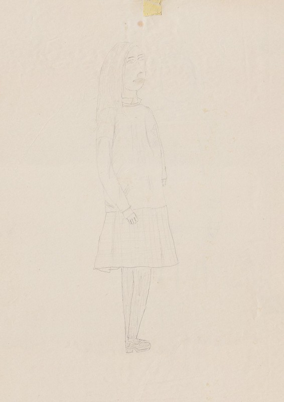
Another pretty decent one, but again, the hands here are a problem, not to mention what's going on with her feet, which appear to be fusing together here.
And finally, the other side of the drawing above. (Man, how cheap were the school not to spring for a new sheet of the cheapest paper imaginable for each drawing? :D) This I guess I didn't get finished before it was time to tidy up, but I thought I might as well get it scanned in for completeness sake anyway.
Until the next exciting installment!
No comments:
Post a Comment