
Oh, we're not done yet; not by a long shot. This time we're starting off with another unused design for the graphic design part of the project: one that I actually already covered here back in 2009, so let's see if I had anything insightful to say:
An earlier design of the book cover I did for graphic design part of the project. It's a flower with each petal depicting a summer scene. I like the flower idea, but the mostly solid blue background is a bit overpowering. While the final design wasn't very original, I think the front cover looks a lot better than this one.
Yeah, so not really. :D I think I was a bit harsh on this though. This is a solid concept; I think it could have made for a more creative piece of work than what I ended up with if I just developed it a bit more. That choice of lettering here though is WILD for the cover of presumably some kind of nature book.
(Plus, and I kind of hate to be gardensplaining here again, but daffodils: famously not associated with summer. And they're all over my final project stuff! I guess though, to be fair, the theme of the project was Summer Memories, not Accurate Summer Memories, so eh.)

And yet more reposts! Fans of my DeviantArt (i.e. literally nobody) will recognize these from a collage I made in 2006 featuring these, the butterfly below, and a random mushroom. Very much appreciate the fave, tinyqueen007.
It's kind of a shame I didn't go on to use any of these designs in the final project work. I think they would have looked great on the batik I made. Well, maybe not the one on the left: it's a bit wonky, though I do appreciate the detail of it being perched on top of a flower here.

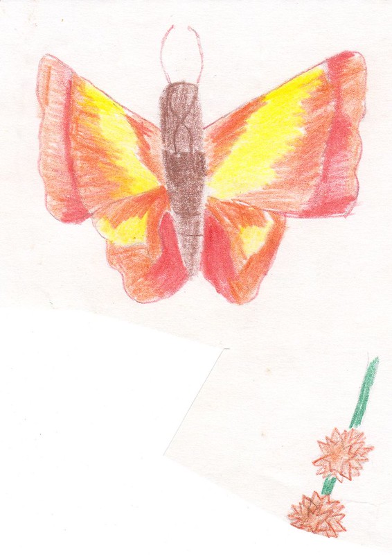
This one I think would have looked especially cool. Look at that rad-ass butterfly; it can't even be contained by pencil lines!

Back to some much earlier work, and some very early attempts at shading here, which I don't remember being received very well at all by our art teacher. Just a fountain of encouragement she was. :D

More designs for my bowl here - the 3D portion of the project. As usual, they're all a bit cooler than the final product ended up being. The one in the top right I really like here: There's kind of a 50's-ish vibe to it. I'm guessing I based it on a daffodil, judging by the colour, though it kind of looks more like a buttercup or something. The one in the middle left here is much the same idea, though this time it seems to be modeled on maybe a rose instead. Could have been pretty neat.
I wouldn't say that I invented Finding Nemo, but....
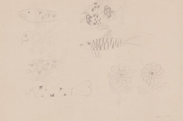
From January 1998, this would have been a very early exercise to explore what kind of things we wanted to base our projects around. I wanna say, and I think I mentioned this before, that we had the choice of animals, flowers, fish, and maybe a couple of others; possibly fruit. Here I tried my hand at some fish. Probably not quite what the teacher had in mind. Those flowers though: not bad, so that's what I ended up going with.
Pay me, Pixar! You cads!

CAN MORE LOAN HOME HELLO DIRTY. I apologize if I've activated any sleeper agents out there. :D
Apparently these words contain every letter in the alphabet,... or something. Can't say I see any Z, or several others though, so goodness knows what that was all about.
What this actually was, as I'm sure you can imagine, was an exercise to practice our lettering in preparation for the graphic design part of the project, complete with a little decorative work in the middle here, which I think I freakin' nailed. Though I don't remember anyone being especially impressed by

And just for completeness sake, the other, much less interesting, side of the sheet.

Back to a little more colourful fare. The shading work here, a little better than the flowers above, but still not quite there.

You've seen the Autumn variation already. Here's the spring one, including some handy colour mixing tips at the bottom.

More 3D designs. Having decided early on that a papier-mâché bowl was the way to go, I'm not really sure what I was doing drawing stuff that I could have only make using clay probably, which woof, working with looked like a way more involved process than I was willing to get into with this project.
Quite like the design on top one here though, especially the more abstract flowers in the center. I think something more in that vein would have probably been a more suitable, not to mention less time-consuming way to go for the final bowl.

What a difference a year or so makes. Still not perfect, but compared to the first set of flowers above, the shading and colouring in this is light years ahead. Beefacke9's Homepage superfans (you know: practically everybody) will recognize this as one of the flowers from the flowers wallpaper I made way back in 2000:

Oh yeah, I've been mining this stuff for content for a long time.

And so we come to the life sketching section of the batch, which is mercifully back down to two this time around. This sketch, not one of the worst. Her proportions aren't too far off here, though her head is still probably twice the size it should be, and those jowls are out of control!

On the other side, things aren't looking too great. Again, her head here is pretty huge, and yikes, those lips, and that nose: it's almost just a triangle! And we have the return of the dreaded tiny hands and feet. In my defense though, it was the weekend before Christmas 1998; an extended period of playing Goldeneye was so tantalizingly close, how could I possibly concentrate on life sketching?

But wait, there's more! Not wanting to overload this post with butterflies, especially ones that had already popped up elsewhere, I shuffled a few of them to the bottom. So, we have two painted ones here, the one on the right having appeared in that DeviantArt collage I mentioned earlier, and the one on the left having appeared in the Arty Screensaver that I posted about in 2009...
... alongside this one. Surely I'll have something interesting to say about these two:
Here we have two butterflies - one done in paint and a lopsided one done with colouring pencils.
Once again, Past JiliK, you have failed me.
No comments:
Post a Comment